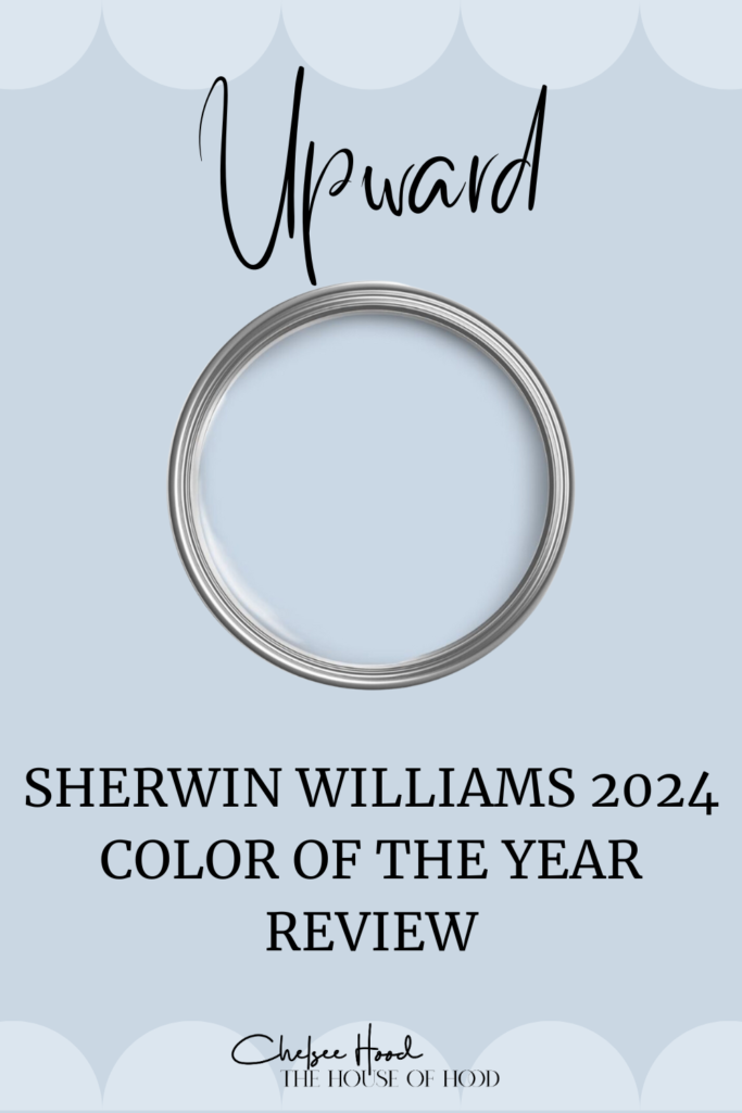
Sherwin-Williams has once again captured the design world's attention with its announcement of the Color of the Year for 2024: Upward (6239). When I was deciding on a coastal blue paint color for our laundry room, I instantly fell in love! So much so, we ended up using it in our mud room and powder room (more on that later!). We went to our local Sherwin Williams and when I saw the Upward handout, I knew I needed to find a spot in our new home for it. "Easy, breezy, light and carefree," according to Director of Color Marketing Sue Wadden. Keep reading for our Sherwin Williams Upward paint review and how we incorporated it into our home!
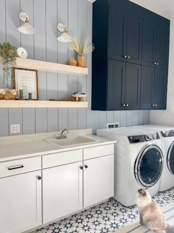
here is Upward in our laundry room
Upward is the perfect color to bring a sense of peace to your home. It's not quite a neutral, but very calm and simplistic. The world is quite frantic right now, so this color is the perfect addition to so many spaces in your home. It is not an overwhelming color at all. Green has been trending over the last several years, and blue is making its entrance. It feels very coastal, yet modern.
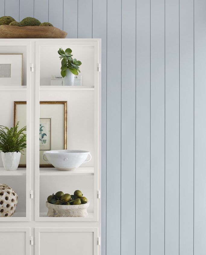
photo via Sherwin Williams
Sherwin Williams Upward has an LRV of 57. LRV stands for light reflectivity value. The higher the number, the more bright your space will be. Our favorite white paint by Sherwin Williams is Pure White and it has an LRV of 84, for example. Upward does not make our spaces appear dark in any way. It can give your space a spa-like vibe.
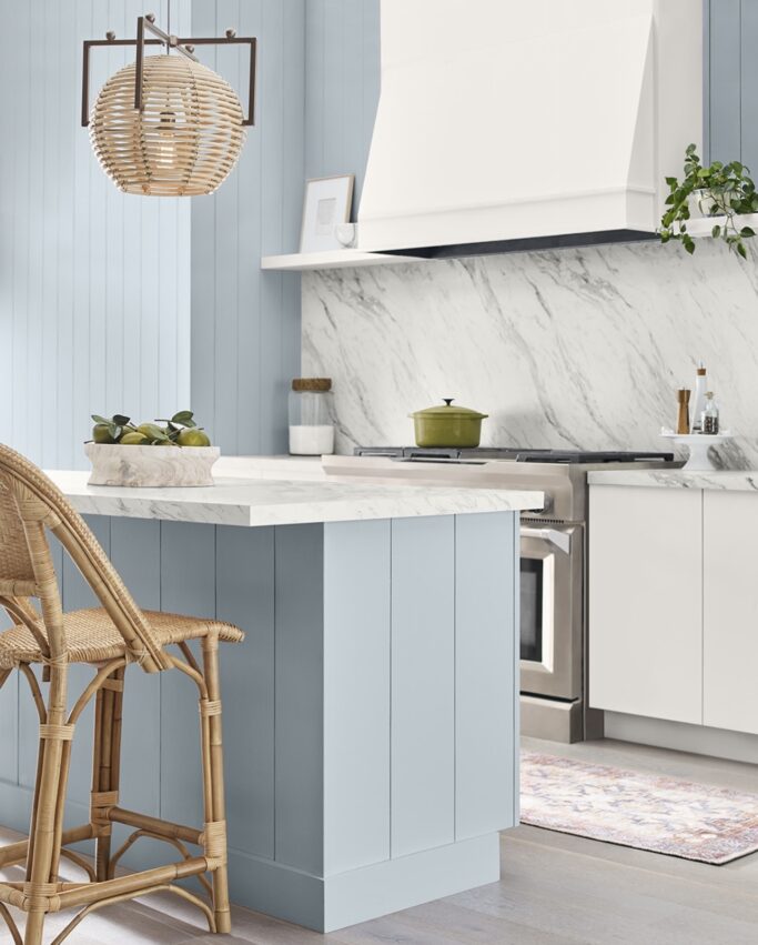
photo via Sherwin Williams
Upward has a color value of R - 191, G - 201 and B - 208. The hex value is #BFC9D0. It is considered a denim blue with calm gray undertones. It works well with a light neutral and a cool pastel. The coordinating colors from Sherwin Williams are Icicle, Extra White, and Natural Linen. You can also pair it with Gale Force, Snowbound, Antiquarian Brown, Drift of Mist, Palm Leaf, and Honeydew.
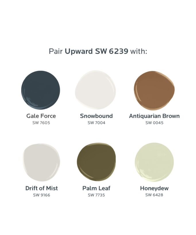
photo via Sherwin Williams
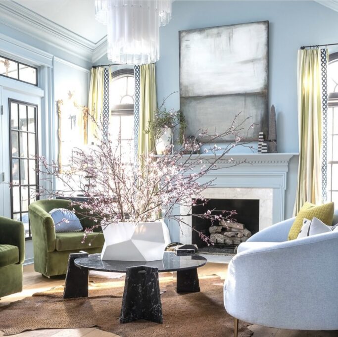
image via Home Bodi Designs
Upward isn't an icy blue like many blues can come across as. It's also absolutely NOT a green blue at all. It's also not a baby blue or a super bold blue. It has a slight hint of violet in rooms with NO natural light (our powder bath). It looks perfectly blue in our mudroom and laundry room that both get morning sun.
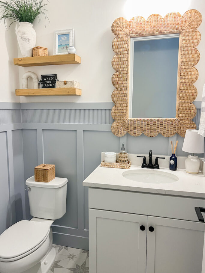
here is Upward in our powder bathroom - check out the full post on our bathroom project here
I think it works particularly well in our home as we have a lot of white and light colors. Although in our mud room, we have dark navy floors and it works really well. Upward it technically a warmer shade of blue.
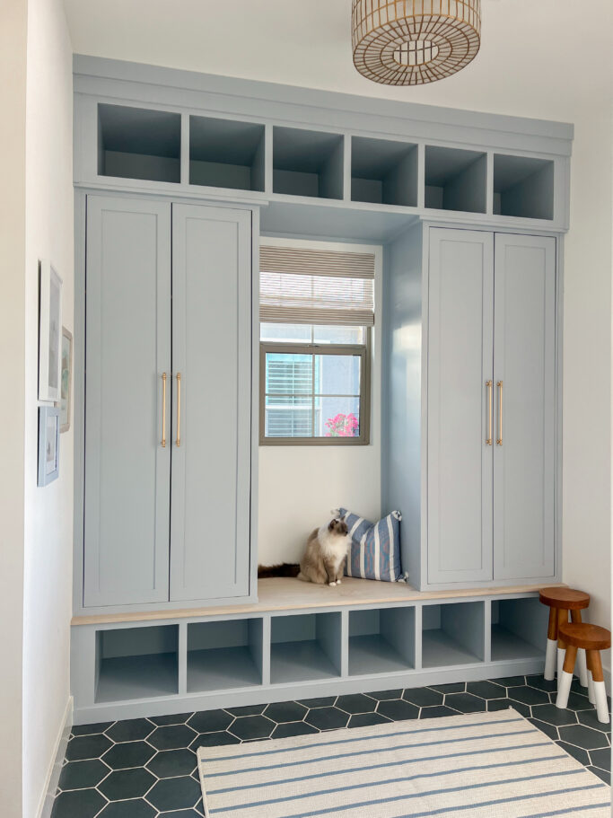
here is Upward in our mudroom
To say I am personally obessed with Upward would be an understatement! After painting it in our laundry room, I knew I wanted to use it in several other spaces in our home. Hopefully you will love this color in your home as much as I do!

photo via Sherwin Williams
Check out these spaces that also used Upward in their home!
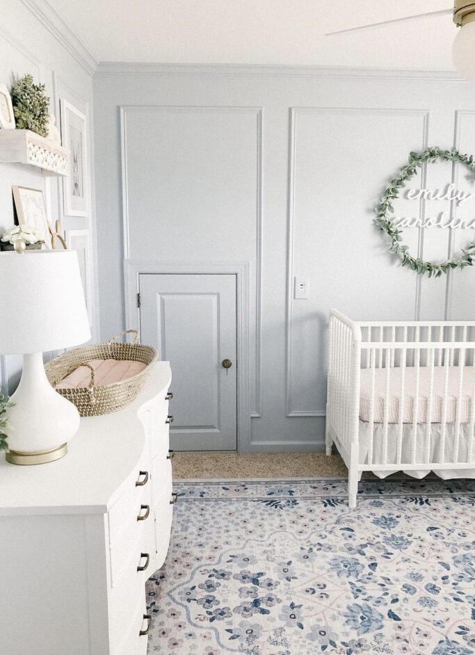
image via Stephanie Hoey Interiors
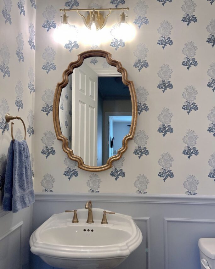
photo via KH Interiors
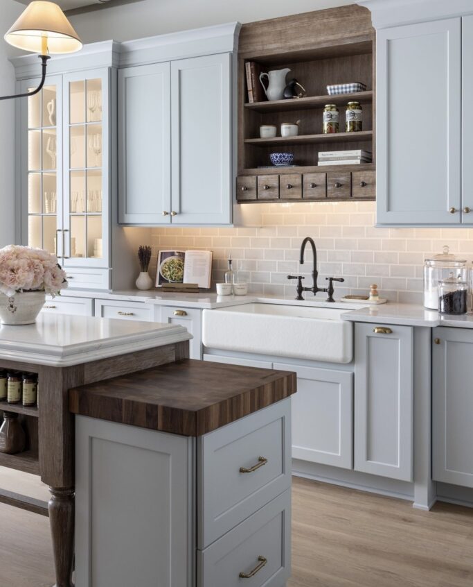
image via KSI Kitchens
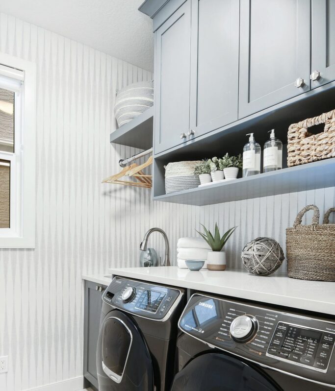
photo via Ana Interiors

image via Willaby Way
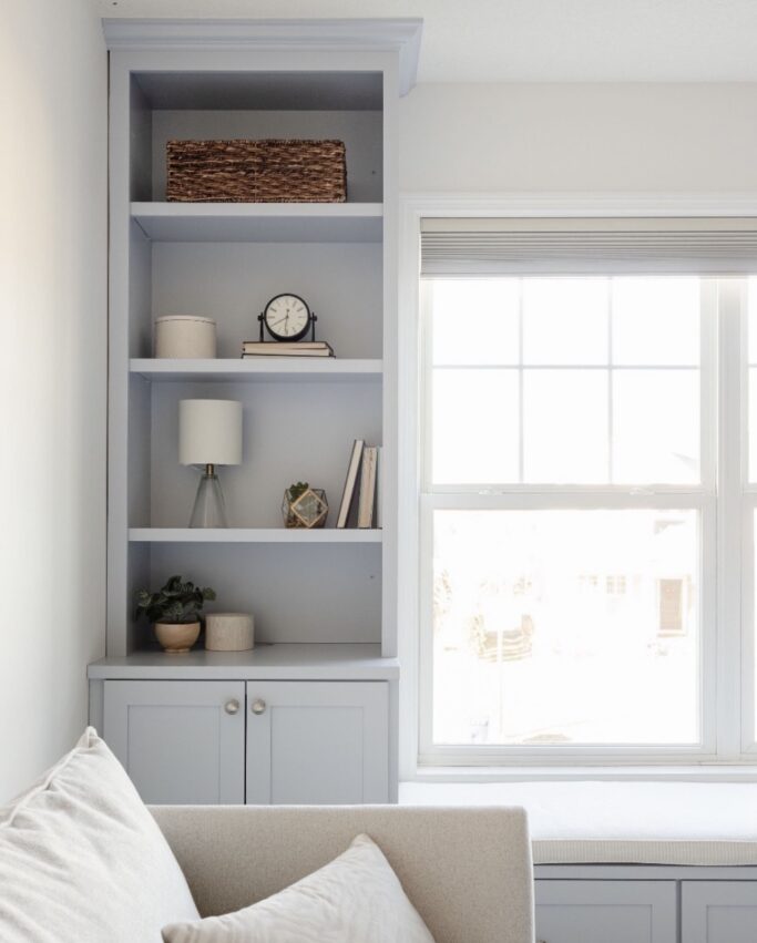
photo via Jamie S Michel
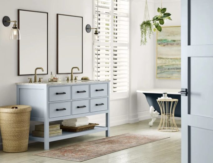
image via Livabl
Sherwin Williams Sea Salt Review // Sherwin Williams Pure White Review // Sherwin Williams Intimate White Review
Incorporating Upward into interior and exterior spaces can transform them into havens of tranquility and inspiration. For interiors, Upward pairs beautifully with a range of palettes, from soft neutrals to vibrant hues.
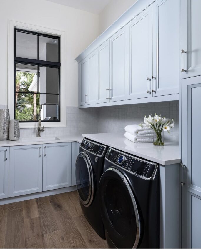
photo via Tye Interior Design
It works wonderfully in living rooms, bedrooms, and bathrooms, creating a calming sanctuary that promotes relaxation and well-being. Accent walls painted in Upward can become focal points, drawing the eye and enveloping the room in its soothing embrace.
Thank you so much as always for reading! Please let me know if you have any questions by leaving a comment below or DM me on Instagram!